Learning with Hands: Making Complex Chart Types Accessible
If you’ve ever struggled to read a complicated chart, imagine trying to understand it without ever seeing it at all. For blind and low-vision (BLV) individuals, that’s not just a thought experiment—it’s a daily reality. Most of the time, BLV readers rely on alternative text (alt text) to access charts. Alt text works well for something simple, like a bar chart. But for more complex visualizations—think violin plots—it can be confusing. Without a mental model of the chart type, even the clearest description can seem abstract and incomplete. That’s where our research comes in. Here, we explored how 3D-printed tactile “template charts” can help BLV individuals learn chart types. Rather than aiming to represent a dataset, these templates help BLV individuals grasp the core concept of each chart type.
Tactile Charts as Templates for Chart Learning
Tactile charts—charts you can explore with your hands by touch—are not new. They have long been used to represent data, helping BLV readers grasp spatial patterns and relationships. But they have limitations: they take time and resources to produce, can’t easily be updated, and are often harder to access compared to digital alternatives such as alt text.
So why do we use them? Because when it comes to learning a chart type—building that mental model that helps future interpretations—touch can be a powerful sense. And unlike data-specific tactile charts, template charts don’t require frequent updates as they are learning tools, not meant to communicate a specific dataset.
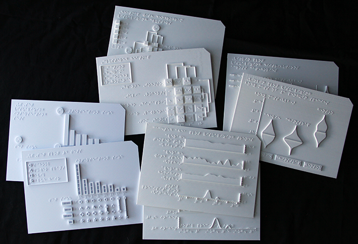
Working closely with our blind collaborators and following an iterative design process, we created educational tactile template charts for four complex chart types frequently found in scientific publications: UpSet plots, clustered heatmaps, violin plots, and faceted line charts (inspired by genome browsers). Each design is accompanied by digital exploration instructions to support independent learning. You can see our final tactile model designs and accompanying exploration instructions on our accessible website.
Do Tactile Charts Help?
We tested our designs of violin plot and clustered heatmap in an interview study with 12 BLV participants. Each participant learned two advanced chart types—one using our Tactile+Text method (a tactile chart with a textual description) and one with Text-Only. Afterwards, we gave them new datasets described only with alt text to see if they could apply what they learned to new datasets differently between the conditions.
The results were striking. Participants not only preferred the hands-on learning experience of tactile charts, but also reported that tactile charts helped them build a much clearer mental model of the chart types they learned. Tactile charts allow them to “picture” layouts and chart element shapes more vividly. Several described the experience as like being able to see the chart. Participants also use tactile charts as a reference in their minds to interpret new alt text descriptions more confidently.
Why Does This Matter?
In our interviews, participants spoke openly about the barriers BLV individuals face in visualization education and communication, and their desire for equal access to information. They saw tactile template charts as a way to bridge that gap, offering a more effective and inclusive approach to visualization education.
In a world increasingly driven by data, data literacy means a lot, such as job opportunities or the ability for equal information acquisition. By using tactile template charts as educational tools, we can equip BLV learners with transferable knowledge—knowledge that carries over to new contexts. Our hope is to empower BLV individuals to be better able to interpret unfamiliar visualizations and to participate fully in discussions with sighted collaborators in academic, professional, and civic discussions where data plays a central role.
We make our models available on the project website, so that anyone with access to a 3D printer can make their own template charts.
Sometimes, the best way to learn a chart is to feel it.
This work was generously supported by the Chan Zuckerberg Initiative.
The Paper
This blog post is based on the following paper:
Using Tactile Charts to Support Comprehension and Learning of Complex Visualizations for Blind and Low-Vision Individuals
IEEE Transactions on Visualization and Computer Graphics (VIS), 2026