Beyond the Demo: Building Visualization Research Software That Lasts
Over the last 15 years, I have been involved in numerous projects that aimed to build visualization research software – not just as demonstrations for papers, but as systems that could be sustained, adopted, and used beyond their original research context. Some of these efforts failed; others achieved tentative forms of success. In this post, I will reflect on what worked, what did not, and what I learned from both. I will discuss different ways visualization research software can succeed: by advancing an idea even when the lasting contribution is the idea rather than the artifact, by turning a prototype into a commercial product, or by growing a project into community-focused open-source infrastructure. Drawing on these experiences, I will offer practical guidelines for researchers who want to build software that survives beyond the initial publication.
This is a blog post based on a keynote given at the VisGap Workshop at EuroVis on Monday, June 8, 2026.
Building visualization research software is not the same as building a prototype, and success does not always look like long-term software survival. Success comes in many nuanced forms. Sometimes the artifact matters most. Sometimes the idea matters more than the artifact. Sometimes the right outcome is a commercial product. And sometimes success means becoming part of the community infrastructure. In the following, I’ll dive into five software projects and reflect on what worked and what did not. For each of them, my ambition starting out was to build software that would be widely used by a community. By that measure, some of these projects failed, while others succeeded.
Failure: Caleydo – Genomics Data Visualization
As a budding PhD student I fell in love with designing and implementing cool visualization systems. The things you can do are exciting, and doing engineering work made me feel like a real computer scientist. At the time, I worked very closely with Marc Streit – sitting in the same office and hacking away on Caleydo, our biomolecular data visualization platform.
Caleydo visualized biomolecular data, ranging from gene expression to copy number data to pathways and how they are impacted by experimental data. We had some wild visualization ideas, including a 3D “bucket” visualization connecting related items with visual links.
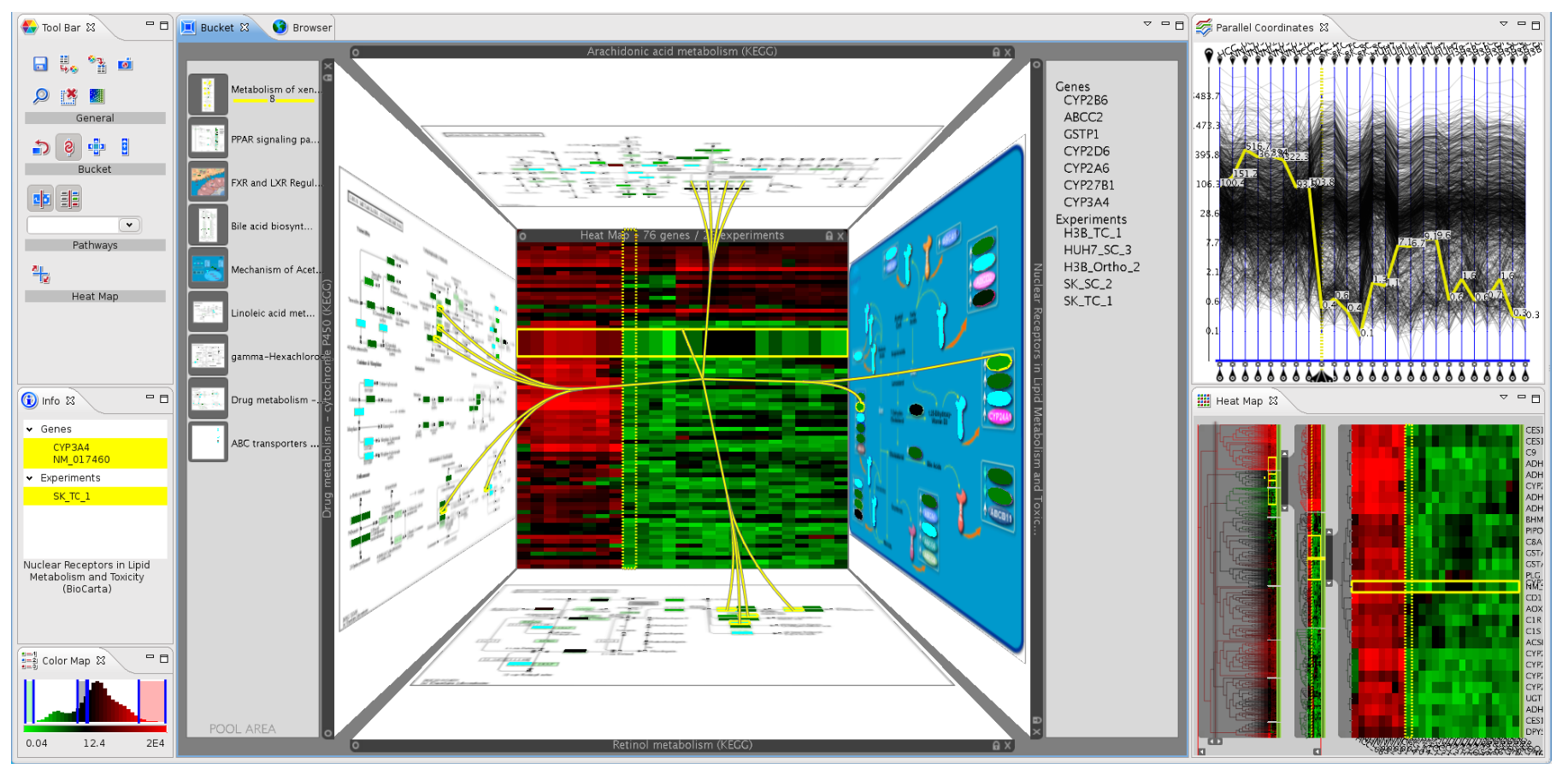
As part of the project, we published several papers, including a paper that got a 3rd best paper award at EuroVis on visualizing patient stratifications – intended to help in characterizing cancer subtypes and a paper in Nature Methods.
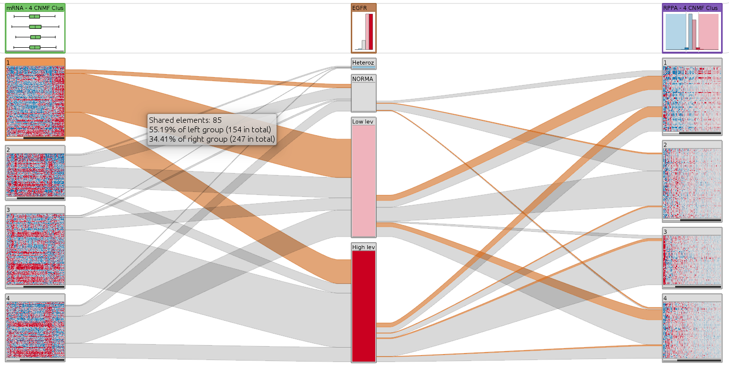 Caleydo StratomeX visualizing the overlap of clustered and categorical genomic data.
While this was a great playground for experimenting with visualization design, we also invested a lot of effort in making sure our software was usable. For example, we built sophisticated data importers and wrote user-facing documentation.
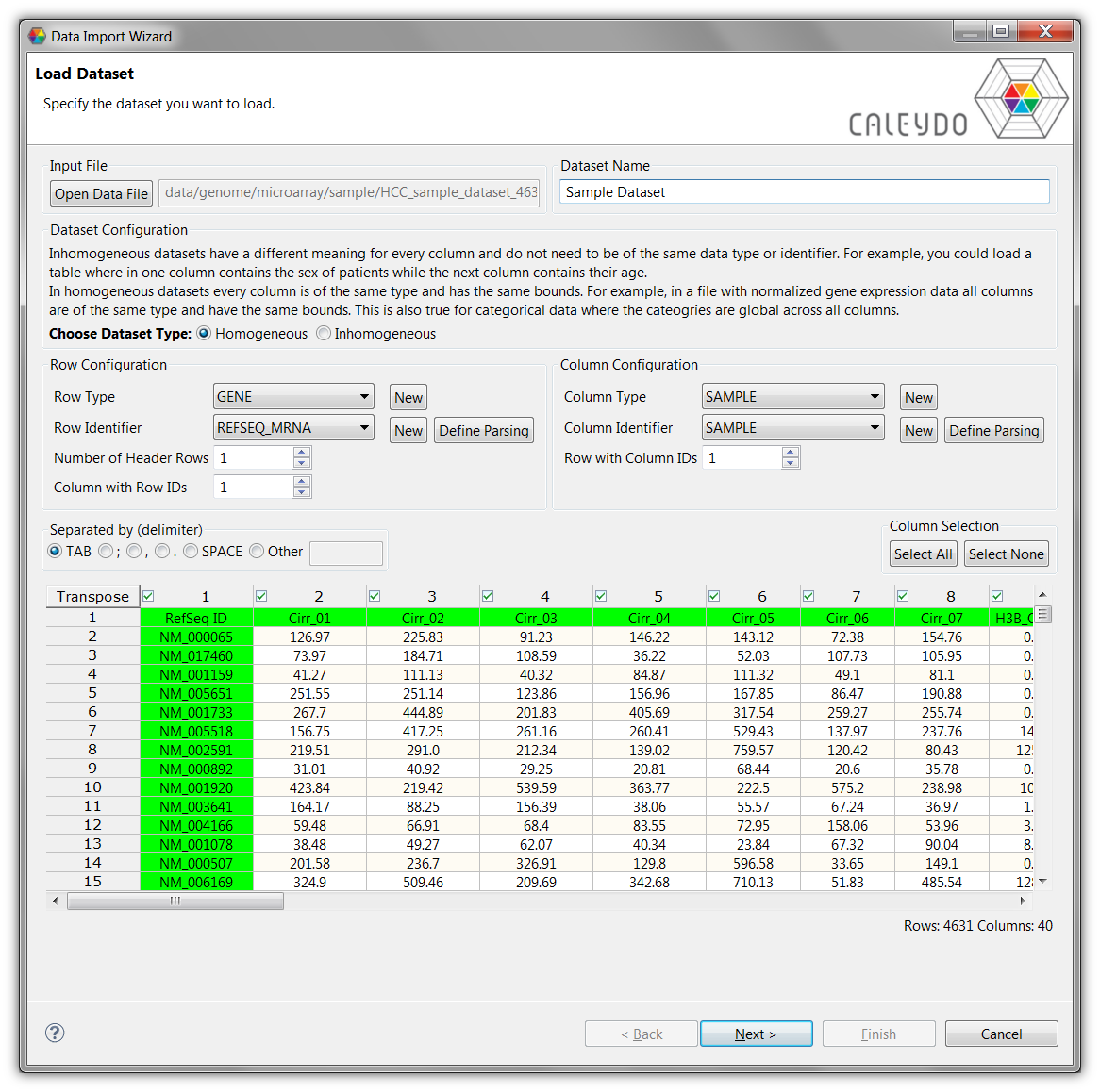
This illustrates that we were serious about building software that could be used by others. But despite our best efforts, Caleydo never really took off. The software was used by a few labs, but it never became a widely adopted tool. So what happened?
Caleydo was discontinued in 2014. There were many factors that led to its demise: First, we had an aging tech stack. Caleydo was built in Java as a desktop application, yet users were coming to expect web-based tools without the hassles of installing and updating software.
Also, we never really broke into the target community (biomedical scientists). We were outsiders to the genomics community, and we did not have the right connections to get our software in front of the right people, didn’t go to the right conferences and didn’t publish consistently in the right journals.
We also never had sustained funding to support the software, and as the core developers aged out of the project, there was no one left to maintain it.
A larger takeaway though is that building and maintaining GUI tools is CRAZY HARD. GUI tools have so much interaction complexity, which makes them hard to build, hard to test, and hard to maintain, which is a significant resource problem especially in open-source and academic settings. Consequently, there are only a few successful open GUI-based tools, such as Cytoscape or Paraview.
Even though it failed as software, Caleydo was still hugely successful as a research project. It produced many publications, led to more than five completed PhD theses, and helped launch two faculty careers (mine included). It also helped me learn a lot about software engineering, and how to build and maintain software in a research context.
Success: datavisyn – From Research Prototype to Commercial Product
Next, I’d like to talk about easily the biggest software success story in my career so far: datavisyn. datavisyn is a company that develops data visualization solutions for pharmaceutical and biomedical applications. It was founded in 2016 by Marc Streit, Sam Gratzl, Nils Gehlenborg, and myself, and is now led by Dominic Girardi, Michael Pühringer, Marc Streit, and many other talented individuals.
The company grew out of academic visualization prototypes, and it was motivated by a simple realization: if we wanted to build and sustain serious visualization software for real users, we needed an organizational form that could support long-term engineering, documentation, hosting, and maintenance.
It started as a ranking visualization for comparing weighted lists – LineUp. The paper was very well received, and the system addressed a real problem: people needed a way to compare rankings interactively, not just read them.

The initial version of LineUp was implemented in Java, but a crucial step was the transition from Java to the web. LineUp also found an audience outside academia. In particular, Marc and his collaborators in the pharmaceutical industry saw enough value in it to expand it to target a biomedical use-case, leading to Ordino, which is now one of the key products datavisyn sells. That was an important signal: the tool was no longer just a research prototype, but something that could support practical decision-making in a domain where ranking and comparison matter.
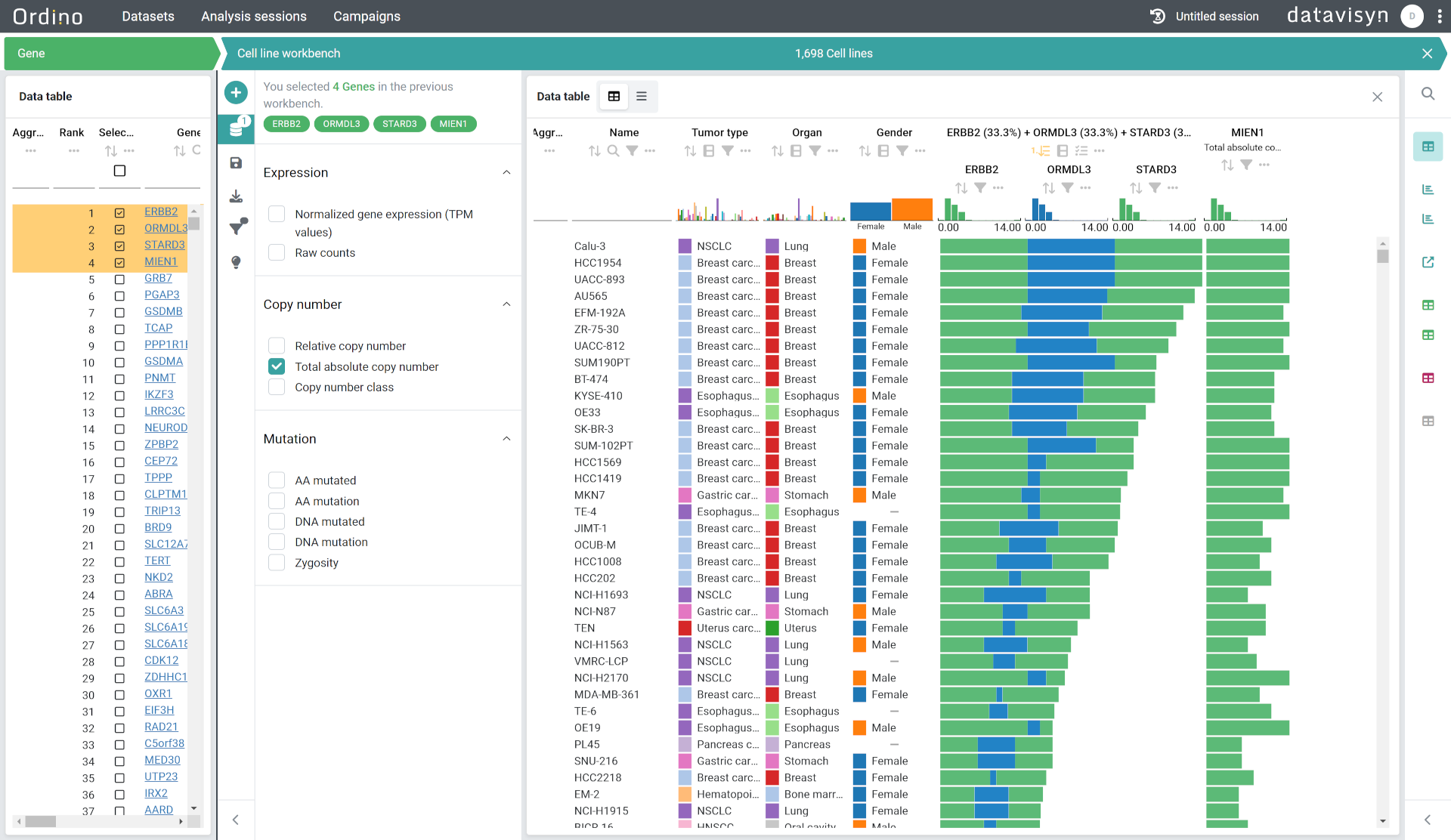
At the same time, LineUp exposed a broader tension that we had already started to feel in Caleydo: academic software development and academic training do not always align well (we also wrote a paper about that). We could not simply assign maintenance and bug fixing to PhD students, because they also needed to do novel research. The more a project depends on sustained engineering, the more that tension becomes visible. That problem became even more pronounced once we moved from “I want to build this myself” to “we need students to help maintain this.”
To address that, we started datavisyn in 2016. The idea was to create a setting in which the software could actually be maintained, hosted, documented, and extended in a sustainable way. datavisyn built a suite of tools around LineUp, and the web-based version remained part of the product. Over time, the company also had to make pragmatic choices about the code base itself: some parts stayed open source, while the commercial products became proprietary. That separation turned out to be harder technically than organizationally, and in the end the real question was not whether the code was open or closed, but whether the overall system could be maintained and evolved.
datavisyn has become a very successful business, with customers that include 7 of the 10 largest pharmaceutical companies. It has also grown into a team of around 40 people, which is a scale that would have been hard to imagine from the original academic project. That scale also makes it possible to build and maintain GUI software well, because the resources are there: there is dedicated staff for UI and UX design, engineering, testing, documentation – all of which would be nearly impossible to sustain in a purely academic setting.
What LineUp and datavisyn show is that a research idea can succeed in several ways at once. The idea can have academic impact. The software can survive by moving to a more sustainable technical stack. And the project can grow into a commercial setting that gives the engineering the resources it needs. That does not happen automatically, and it is not the right path for every project. But in this case, it turned a visualization idea into something that lasted much longer than a paper prototype would have.
Success: UpSet – Visualizing Intersecting Sets
UpSet is a very different kind of success story. It started with a simple but important problem: how do you visualize intersections between more than three sets? At the time, existing approaches did not scale well to the kind of set relationships we kept running into in practice. The original paper, published in 2014, was very well received, and the idea clearly hit a nerve in the visualization community. You can read my reflections on UpSet blog post that I wrote when UpSet received a Test of Time Award at IEEE VIS.
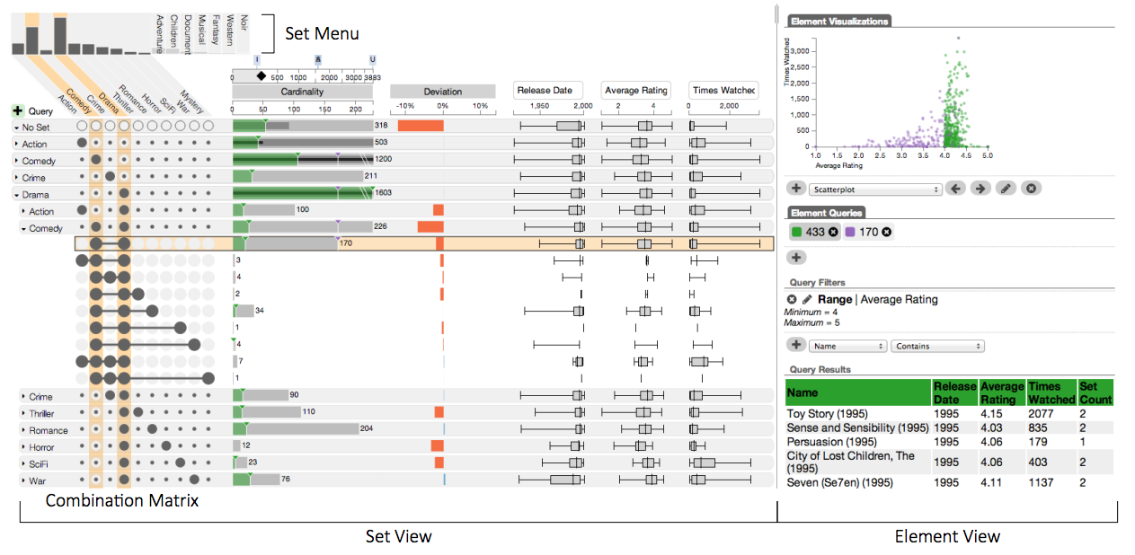
What made UpSet take off was not just the novelty of the visualization, but the fact that we met users where they were. In particular, the R version of UpSet fit naturally into the publication and analysis workflows of the life sciences community. That mattered enormously, because it made the method immediately usable in a setting where researchers already worked. The result was that UpSet did not just get cited heavily; it became a widely recognized way of thinking about set intersections.
Over time, UpSet also showed something important about research software: the idea can outlive the implementation. UpSet has been reimplemented multiple times, and at this point the various software versions are probably less important than the concept itself. That is not a sign of failure. On the contrary, it is a sign that the idea solved a real problem well enough to spread beyond the original code base.
Interestingly, UpSet was also not a project that was funded. Only in 2022 did we receive a grant that allowed us to build UpSet 2: a React-based version that can be used as a library or through a web interface for uploading data. UpSet 2 also added accessibility goals, including support for blind users. That sequence is telling: sometimes the strongest software ideas succeed first, and the funding follows much later.
So UpSet is a success story: It solved a real need, it fit the workflow of its target users, and the idea proved durable enough to survive multiple software generations. In other words, the lasting contribution was not just the artifact, but the concept itself.
Failure: MultiNet – Good Engineering Was Not Enough
At this point, one might think I had finally figured out how to build successful visualization software. We had learned from earlier projects, and in 2019 we received a substantial infrastructure grant to build MultiNet, our platform for visualizing multivariate networks. The goal was ambitious: professionalize the software development process, build a real platform, and create something that could support both research and use.
This time, the engineering side was much stronger. We worked with Kitware, an experienced open-source science software company, and we also hired professional software engineers ourselves. MultiNet became a real, working system with adjacency-matrix and node-link views for multivariate networks, and users could upload their own data. On paper, this looked much closer to the kind of sustainable research software project we had been trying to build all along.
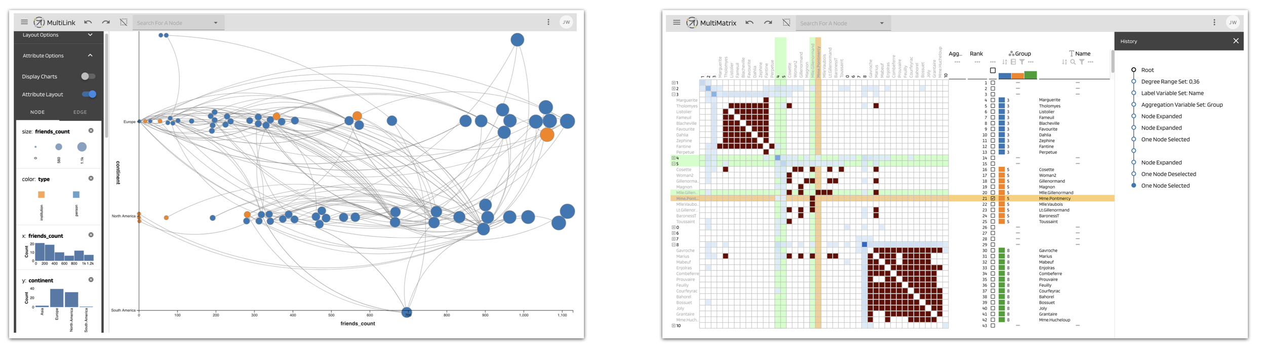
And yet, MultiNet still did not really take off as a widely used network visualization platform. The problem was not the implementation. The problem was that the scientific momentum was weaker than the engineering momentum. The science team was never quite as invested in publishing novel network-visualization contributions, and there was not a strong enough core of people who felt passion for the project itself. Students rotated through, collaborators had specialized needs, and the project never developed the kind of sustained excitement that keeps a research software platform alive.
That was an important lesson for me: even if you get the engineering right, that does not automatically make the project successful. Research software also needs evangelists, committed users, and a community that keeps pulling it forward. MultiNet had solid infrastructure, but not enough social and scientific energy to become the kind of widely adopted platform we hoped for.
Success: reVISit – Building for our community
Finally, there is reVISit, our open user-study platform. Together with co-PIs Lane Harrison and Andrew McNutt, and a very capable team, we built reVISit as a platform for running open, reproducible visualization studies. Unlike some of our earlier projects, this one is much more tightly connected to the community we ourselves are part of, which makes a big difference: we can find users, testers, collaborators, and adopters much more easily because we are already in the same conferences, workshops, and discussions.
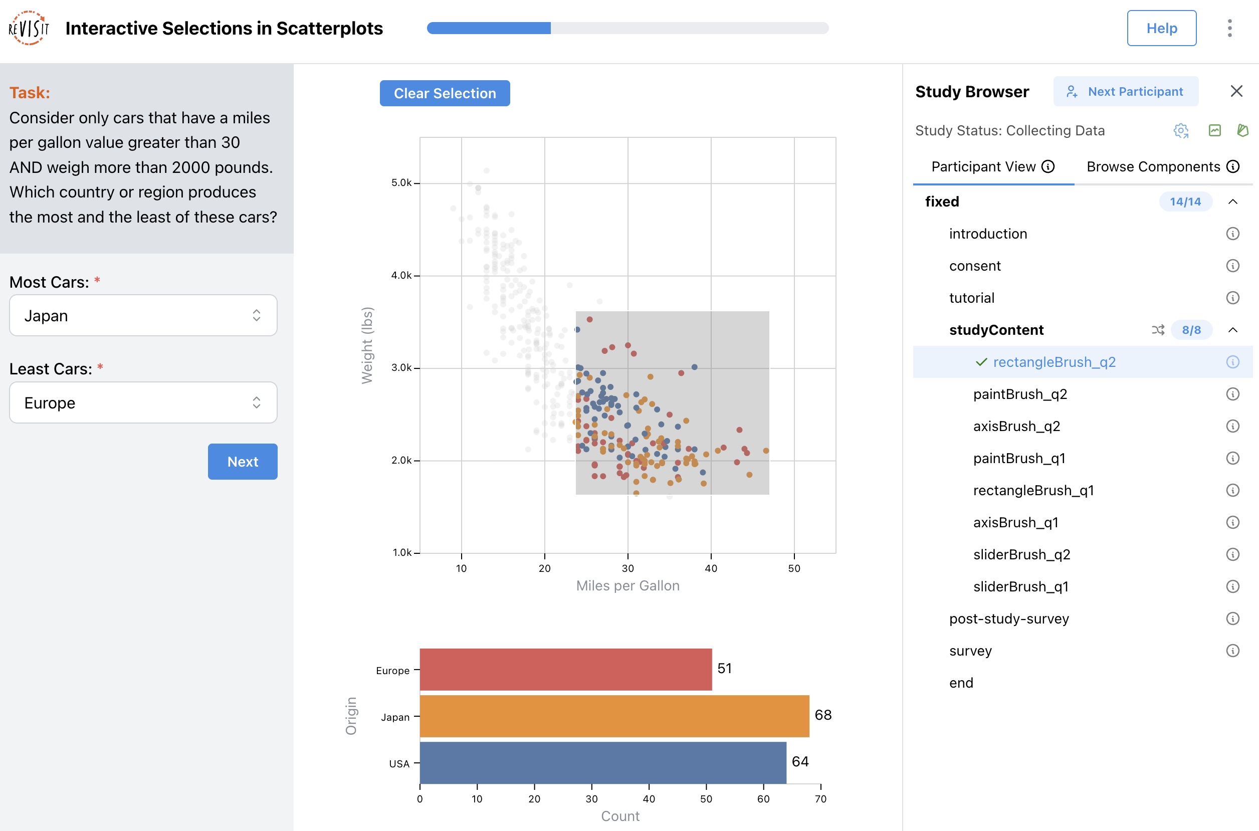
reVISit is also deliberately designed to avoid some of the classic problems of visualization software. Instead of exposing a large and fragile GUI for every aspect of study design, it uses a DSL for writing experiments, which makes the system more manageable and easier to maintain.
That focus has paid off. reVISit has seen meaningful early adoption, some community contributions, and strong scientific output, including a best paper at IEEE VIS. Just as importantly, the project has kept both the engineering and the research side engaged: there are now spin-out paper projects that build on reVISit or add new capabilities to it, which helps keep the platform alive in a way that pure maintenance work often does not.
At the same time, reVISit is not without challenges. We have tried to avoid offering hosted services for legal and practical reasons, but a server-based offering would certainly make the system easier to use. Similarly, a GUI for experiment design would lower the barrier to entry for less technical users, which may be critical as we attempt to branch into fields outside of computer science.
Funding is also an ongoing concern: the current support from the National Science Foundation is generous, but it will not last forever, and we need to think carefully about what comes next. Still, reVISit feels like a genuine success story because it combines a useful tool, a real community, and a research agenda that continues to produce new work.
Reflection
Looking across these projects, a few patterns become hard to ignore. Prototypes are not the same as visualization tools, and GUI software in particular is expensive to build, hard to test, and hard to keep alive. It ages quickly, and there are surprisingly few examples of large, successful open GUI-based tools. In practice, libraries are often the more realistic form factor: they are easier to reuse, easier to maintain, and can stay relevant even as the surrounding software changes.
The other major issue is incentives. Students need papers and short-term wins, collaborators want analyses and concrete results, and faculty have longer horizons but often cannot do all the implementation work themselves. That means the people doing the science, the engineering, and the maintenance are often not optimally aligned. When those incentives are misaligned, software projects become fragile very quickly.
That leaves sustainability as the central challenge. Continuous funding is difficult, and maintenance is rarely rewarded in the same way as novelty. Commercialization can solve part of that problem, but it is not a universal answer. In some cases, the best outcome is not a durable application at all, but a durable idea, or a library, or a community infrastructure layer that others can build on.
In the end, I do not think of these projects as a clean success or failure story. The outcomes have been mixed, the funding has often been precarious, and sustaining software over many years is genuinely hard. But I still find this work deeply rewarding. It is a rare privilege to build things with students, to work alongside professional engineers, and to move between academia and industry. That mix of perspectives is intellectually stimulating and, at its best, a lot of fun. It is difficult work, but it is worth doing.